This weekend my husband and I went to the INTERIEUR 2010 exhibition in Kortrijk. Every two years this interior design exhibition shows us the latest trends in modern design. A lot of European exhibitors are present, introducing their innovations to the public.
If you want to know more about this fair, please visit the website www.interieur.be.
I want to share with you some company addresses and new products which catched my eye.
TULP FIREMAKERS
www.tulp.eu
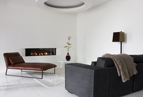
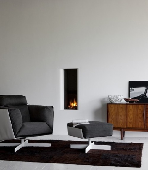
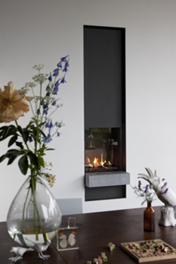
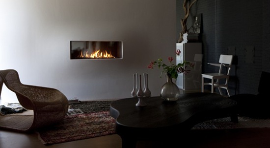
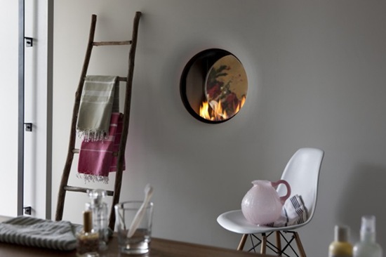
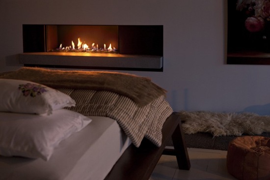
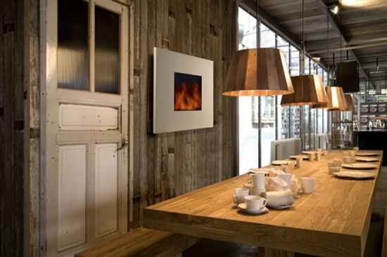
This is a Dutch company that produces beautiful gas and led fireplaces.
They call in famous designers to design a fireplace, as Piet Boon, one of the most talked about designers of The Netherlands.
 Gas fire design Piet Boon
If you want to know all about Piet Boon, visit his website www.pietboon.com
 Gas fire design Piet Boon

Gas fire

Gas fire

Gas fire

Gas fire

Led fire

Led fire

Led fire

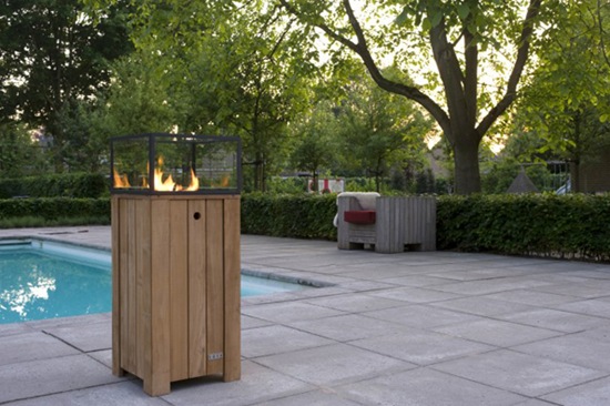
Even a beautiful teak gas fire for outside use.
So if you want some further information please visit the website www.tulp.eu.
___
LAURA MERONI
www.laurameroni.it
An Italian company designing beautiful made to measure furniture and paneling.
The doors and especially the paneling caught my eye!

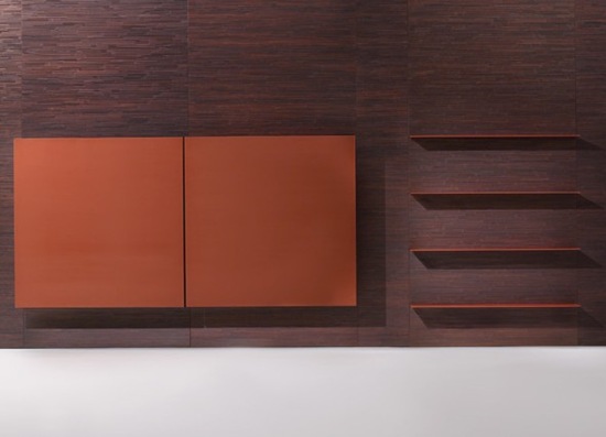
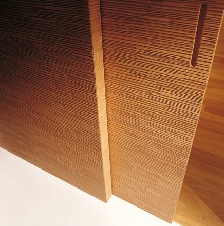
I really love this dark colored carved rosewood paneling! Very contemporary but very beautiful to me!

Brushed lacquered wood cabinet

Doors available in mapple, cherry wood, walnut, rosewood, oak, teak and wenge.

Detail of the wall board with integrated sliding door, carved on both sides.

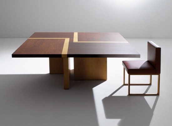
Wooden table with inlaid top.
For further information, please visit the website www.laurameroni.it.
___
HYDROSTOP
www.hydrostop.be
Hydrostop is a Belgian importer of bathroom design products.
These designs catched my eyes!
I am so sorry that I can not give you more details about the sinks and the bathtubes, because I did'n’t have enough time to talk to the representative of this company.
But I would not hold you back discovering these products.


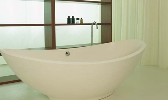
What do you think about this elegant bath tube here below? I actually didn’t discover it at the fair, but visiting the Hydrostop website, my eyes catched this bath tube design with the French LXV-styled legs. I hadn’t seen it before! Do you love it? I do!

To see more bathroom designs, please visit the website www.hydrostop.be.
___
FORMANI
www.formani.nl
Again a Dutch company that designs and imports high-quality door and furniture fittings in various styles.
And even this company calls in famous designers to design their fittings!
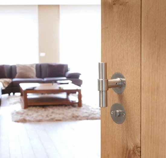
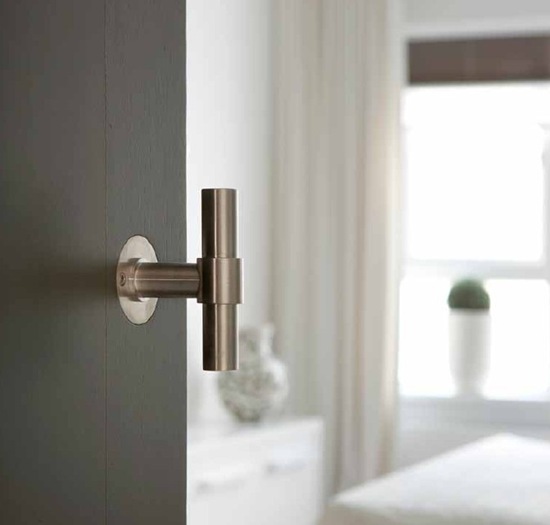
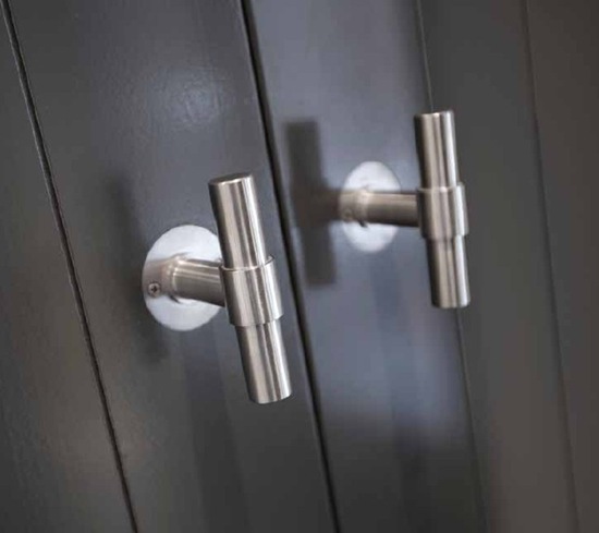
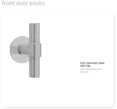
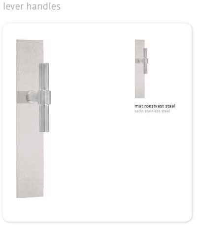
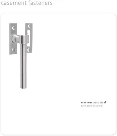
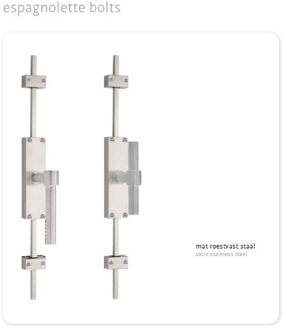
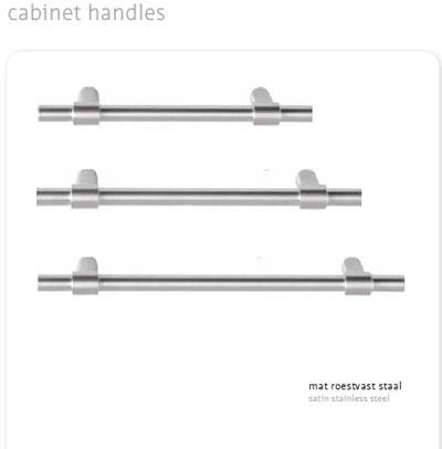
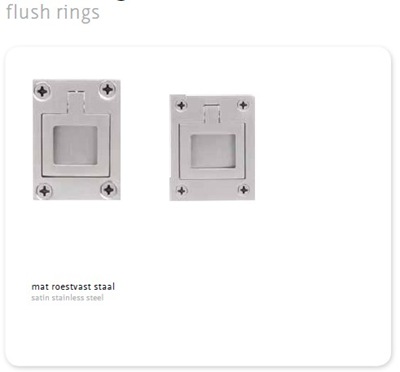
I love to show you the door handles, furniture and window fittings, designed by (again indeed!) Piet Boon.


This company has next to the Piet Boon designs, a wonderful collection from other famous designers to discover!
For further information, please visit the website www.formani.nl.
___
BERKER
www.berker.com
Berker is an international company and a supplier of high-quality switches, for all kind of interiors, from the luxurious atmosphere to the industrial look! They emphasis on quality, design and innovation.
Their switches are in use all over the world.
Let’s see some of their switch ranges.

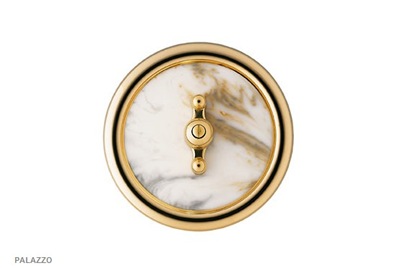
 A switch from the Palazzo range. With marble and mahogany effects and 24 carat gold-plated décor rings.
This piece is like having a jewellery on your wall!


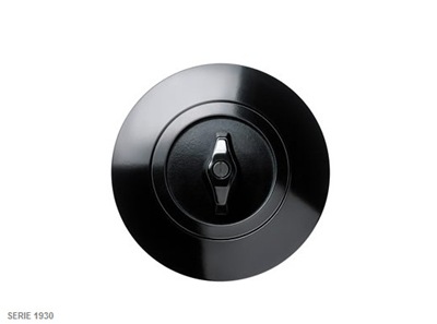
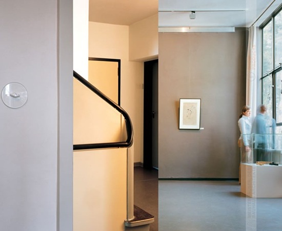
A switch design in Bauhaus style (1930).

 Switch from the fine classic style design.

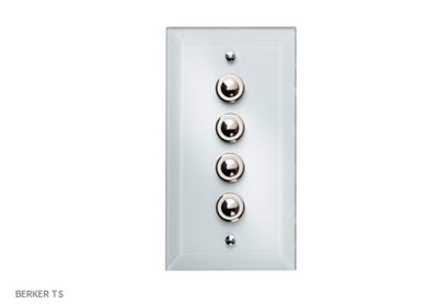
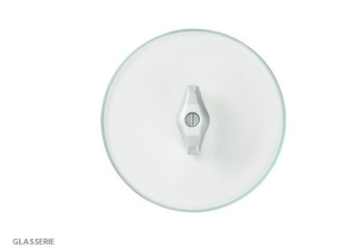
 Glas serie switches.

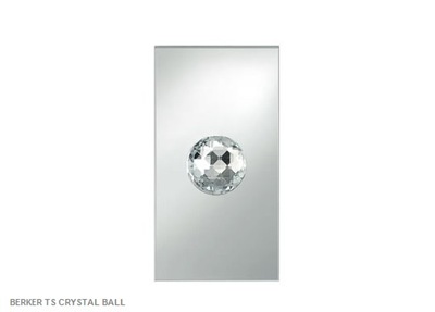
Crystall ball range.
To choose your individual switch, please visit the website www.berker.com.
___
NIKO MYSTERIOUS
www.nikomysterious.eu
And last but not least, I want you to meet the mysterious switch collection of the Belgian company NIKO.
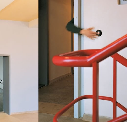
The Niko Mysterious wave contral makes life easier! Coming home with your hands full of shopping bags of files? Then you no longer have to put everything down to control the light switch.
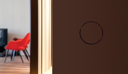
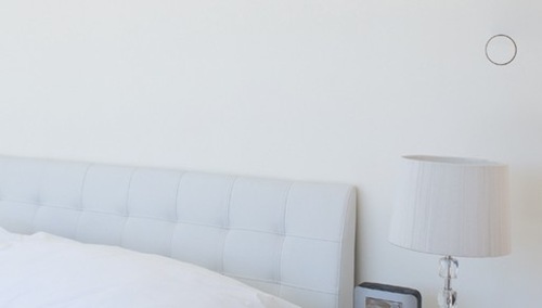
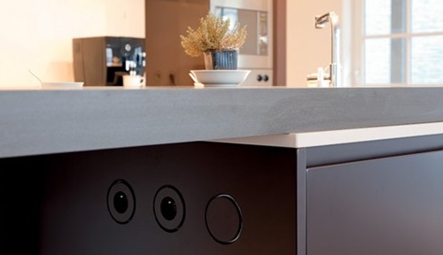
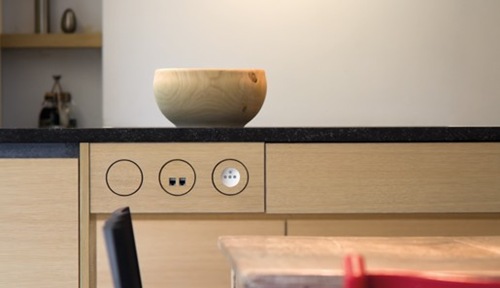
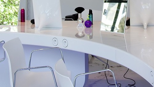
The switches are almost invisible integrated into the wall of the woodwork. It adapts itself to the color of the wall. Only a discreet circle remains visible. In the dark this circle lights up with a soft, warm, white glow.
The wave control activates lighting by waving at a distance. When you are 50 cm away from the switch, its edges light up and when you wave within 10 cm, the switch is activated.
Let’s discover THE ART OF DISAPPEARING!

You can paint or wallpaper over the switch.


Niko Mysterious socket outlets and media connections can also be integrated into the wall or into the woodwork.


Discover more about the Belgian Niko Mysterious collection, visit www.nikomysterious.eu.
___
I hope you will be happy with the addresses of the companies and their innovations I shared with you today!
xx

All images of the websites of the respectively companies.


